Challenge
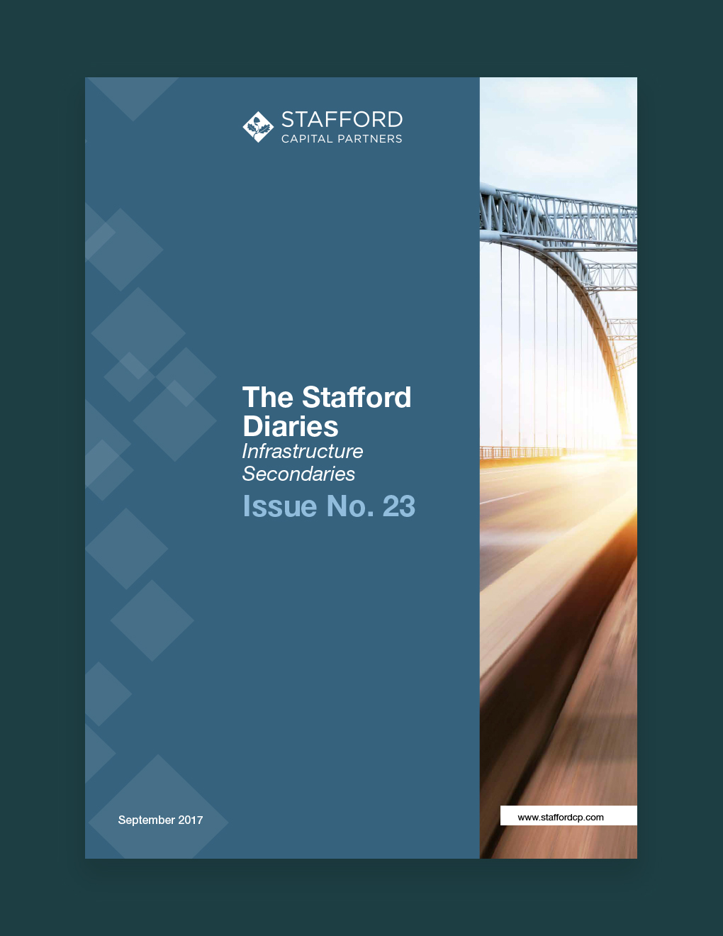
To create a new visual style for Stafford’s range of ‘Diaries’ which would more effectively communicate market information to its investment audiences.

Process
Historically, much of Stafford’s collateral was created in house for subsequent distribution. We proposed creating a communication style that would allow staff to create content in house that could then be easily transformed into engaging collateral. We pared back the amount of content on each page so that the audience wouldn’t be overwhelmed by the quantity of copy. This also gave us the ability to draw out key information such as quotations and fact snippets. We included elements of the brand in the design and ensured that all charts and diagrams utilised consistent colours to encourage brand reinforcement in all customer facing collateral.
Outcome
We’ve produced several editions of ‘The Stafford Diaries’ which now all conform to Stafford’s new visual style. Collateral is clearly segmented making content easy to find and understand. The consistent style also means that Stafford staff are able to easily specify content to be highlighted within the collateral as pull-outs.


