Challenge
To create a new visual identity for Sterling that would better reflect their position in the market, boost employee morale and support their potential growth towards new service offerings for clients in a global market.
Process
We began by holding various discussions, workshops and research sessions that helped us get a really strong understanding of Sterlings employees, customers and aims. Using the information gathered from these sessions, we then did extensive studio research into competitor branding, styles, colours, typography etc.
Having studied all of the research gathered, we noticed some clear routes that we thought would be worth pursuing. We developed a series of concepts, and working with the client we narrowed down these concepts into a final route.


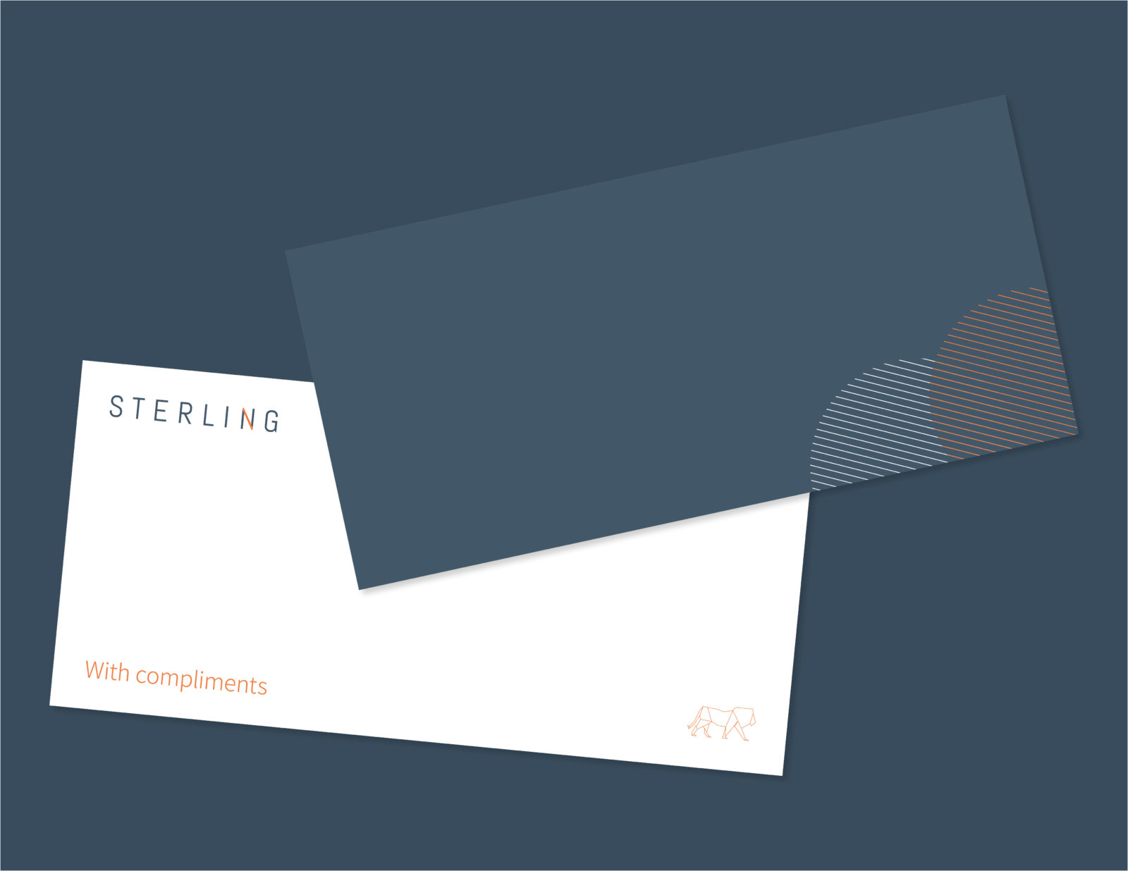
Sterling provides a platform for businesses to store and access secure files, and the identity takes a simple, clean and pleasing pattern and utilises movement and structure to convey the idea of access and connection. Across digital platforms, movement can convey this message in a pleasing and contemporary way. The pattern also sits across print deliverables, creating an elegant and sophisticated style. The logo also utilises this idea, and the orange connection can be seen linking the two pillars of the N.


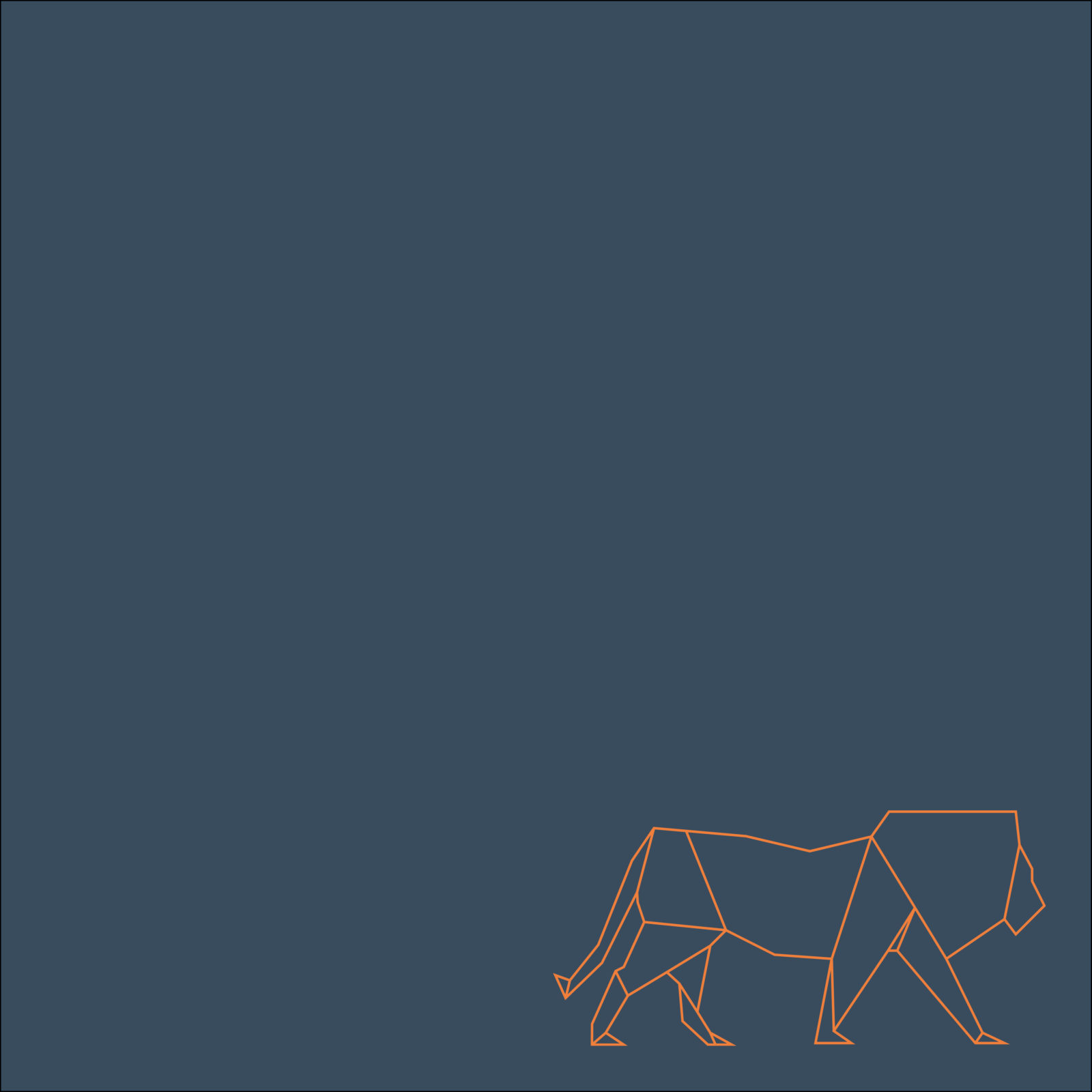
The brand also includes a geometric lion, that ties in with the style of the access patterns. The lion nods back to the original Sterling brand, helping customers make the connection to the company they know and trust. The lion can be seen across various deliverables, representing Sterling’s employees, always present, prowling and protecting your data. It is also used internally to create comms that boost morale and encourage collaboration.


Outcome
The new visual identity received universal support internally (no small feat!) and has generated extremely positive feedback from both new and existing clients alike. While it can be difficult for Sterling to fully ascertain how client decision making is influenced on each successful deal, Sterling’s marketing team are confident that the new brand identity has been an important factor in a number of new deals that have been secured.
Questions to the client
What’s the best thing about working with us?
It has to be the team. Compared to a big agency where I’d probably get one or two junior members of staff, working with Fever means access to the whole office. Everyone is professional, easy to deal with, and – crucially – good fun at the pub.
What 3 words would you use to summarise the project?
Collaborative
Successful
Fun
How did you feel when you first saw the concept proposals?
Shocked, actually. I very rarely see agencies produce work that’s on the money first time round. Fever produced not one, but three or four ready-to-go concepts that would have hit the brief. It was really impressive.


