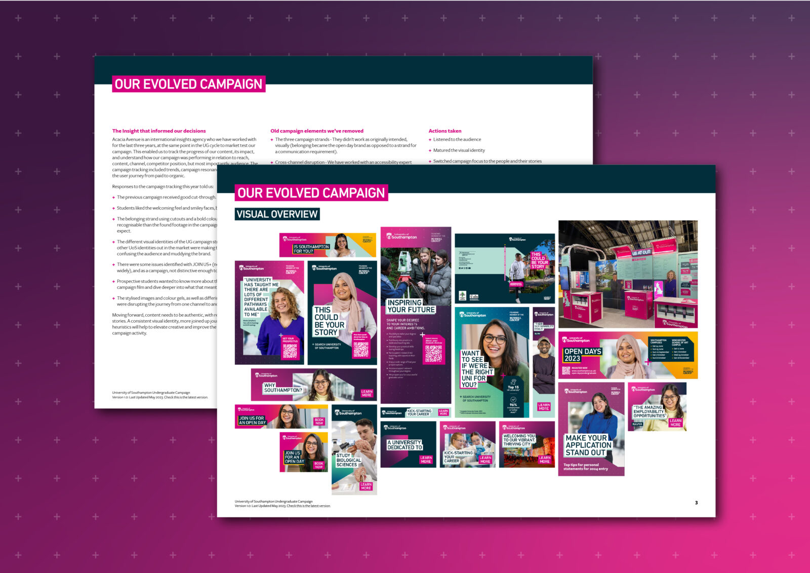

After a period of approximately 18 months using the undergraduate campaign, the university’s campaigns team felt that they needed support to evolve the campaign so that it could be used to communicate more effectively with prospective students at all stages of the decision making journey.The University had been tracking the impact of its previous campaign to understand how it was performing. There were successful existing elements to be leveraged, others that needed to be honed to be more effective and some that were causing confusion and needed to be removed. Having worked extensively in the application of the existing campaign, we were a natural fit to support the university with this project. We worked closely with the university’s campaigns team to develop the campaign with accompanying identity guidelines over a period of several months.
After identifying the successes and shortcomings of the previous campaign, we worked to develop the visual aspects that make up the new execution. This involved clarifying the use of historic elements as well as designing new ones, redefining the image styling, typography, colour use and messaging. The resulting guidelines provide the client with a toolkit of design elements that can be used to create a diverse but cohesive range of creative outcomes, including background gradients, cut-out imagery, type styling and graphic devices. We established clear guidance for use for all of these elements, creating a streamlined campaign that can be implemented intuitively and deliver a more consistent message.
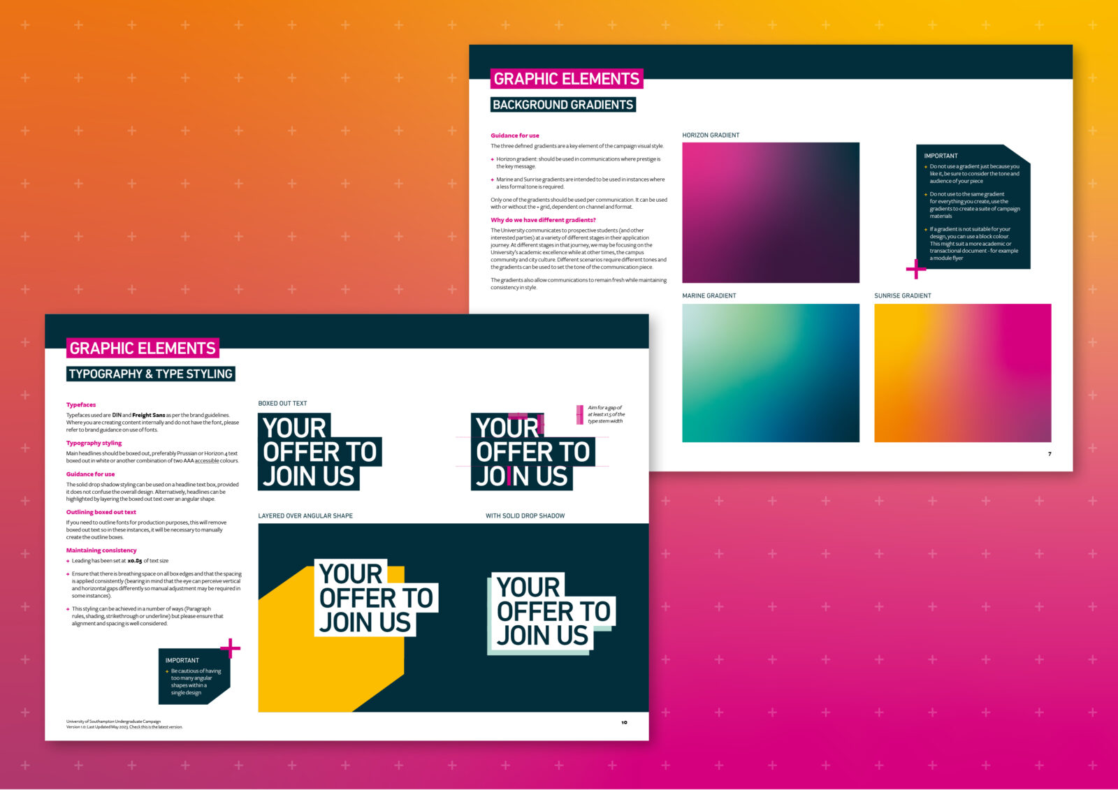
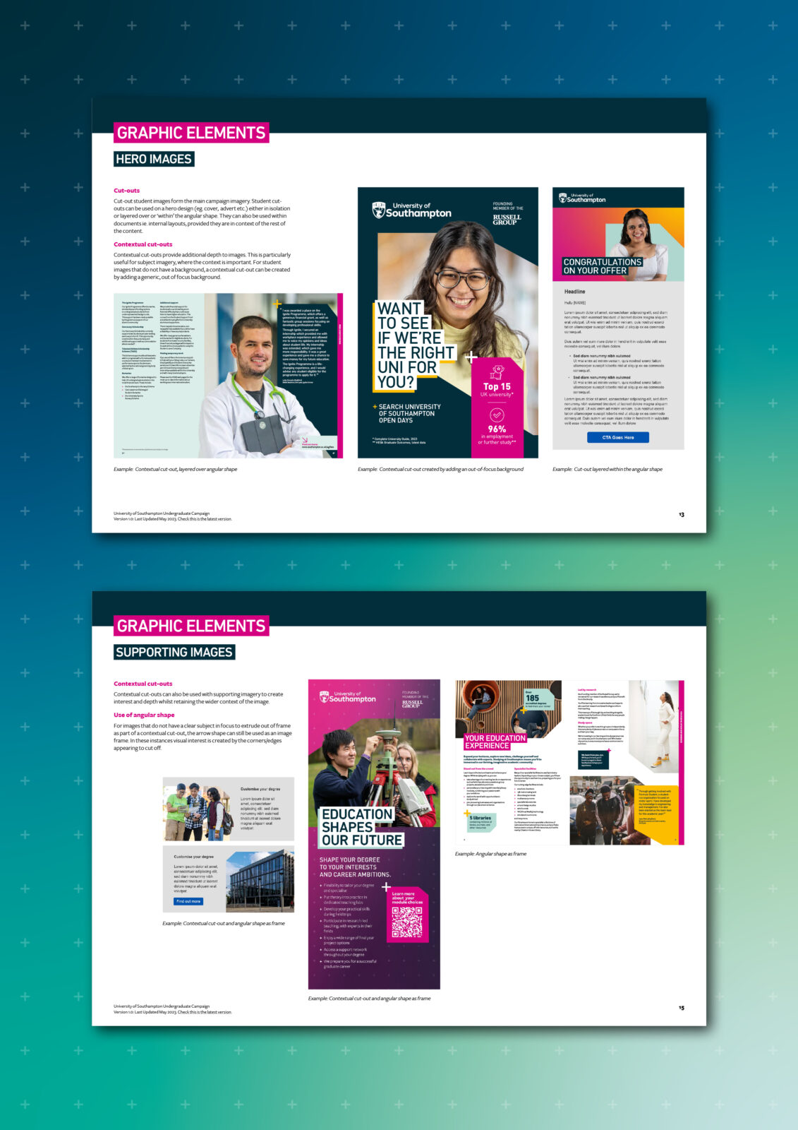
The use of colour gels on imagery in the previous identity had proved an issue for accessibility, added to cross-channel disruption and confusion across visual identities. To tackle this, we developed a new campaign image style. We retained the cut-out styling, but used full-colour photography and introduced ‘contextual cut-outs’ which include elements from the image background. As well as creating dynamic visuals with additional depth, this image style retains more of the image context, adding to the authenticity of the real student stories being portrayed.
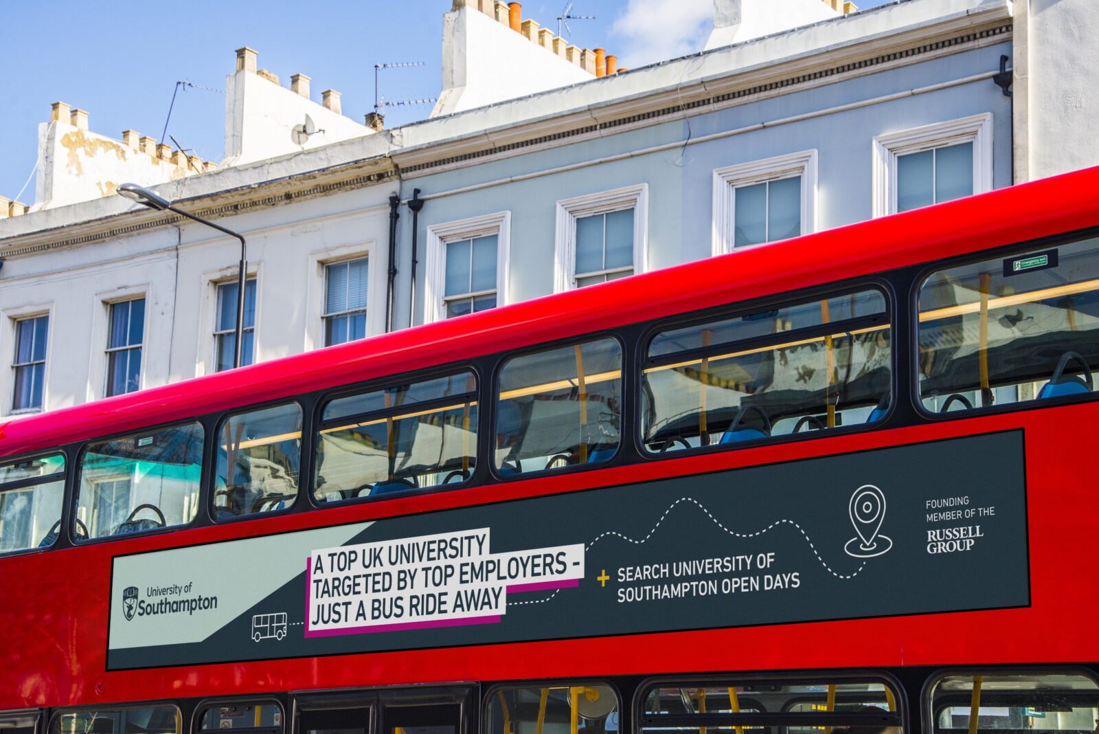
The campaign guidelines were designed to continually evolve with the changing needs of the client and its audience. Since initial publication of the guidelines, the new undergraduate identity has been executed across a wide range of deliverables. When we were tasked with designing an extensive out of home advertising campaign, the flexibility of the visual identity enabled us to apply it in a way that championed the messaging without the use of photography.
